Step 11
Favourite Places
Our next step will be adding a "favourite" state to our data, so that the user can chose which points on the map are his favourite and render them differently.
We will start by making the first item in our data a favourite point by default.
Update the points array in Map.jsx so that the first array item ("The Wall")
has a favourite key set to true.
// app/js/components/Map/Map.jsx

  const points = [
    {
      x: 450,
      y: 110,
      details: {
        name: 'The Wall',
        house: "Night's Watch",
        words: 'Night gathers, and now my watch begins.'
      },
+     favourite: true
    },
    {
      x: 375,
      y: 355,
      details: {
        name: 'Winterfell',
        house: 'Stark',
        words: 'Winter is Coming'
      }
    },

    ...

  ];
We will be showing a different pointer image when a pointer has the "favourite" state, so let's copy that asset into the application via our terminal.
cp .assets/pointer-fav.png app/img
We will then add a new style rule to the Pointer.css file which will set the
background image to the new image. Add the .favourite class after the
.pointer class.
/* app/js/components/Pointer/Pointer.css */

.favourite {
  background-image: url('../../../img/pointer-fav.png');
}
Next we will update the internal state of the Pointer component and tell the
component if this point is a favourite or not. Since the favourite prop is now
being passed in from our data we have to update the propTypes and set
favourite key in our state via the passed in props.
// app/js/components/Pointer/Pointer.jsx

  constructor (props) {
    super(props);

    this.state = {
      open: false,
+     favourite: props.favourite
    };

    this.toggle = this.toggle.bind(this);
  }
// app/js/components/Pointer/Pointer.jsx

  Pointer.propTypes = {
    details: PropTypes.object.isRequired,
    x: PropTypes.number.isRequired,
    y: PropTypes.number.isRequired,
+   favourite: PropTypes.bool
  };
We will then use the classnames library again to conditionally apply the
.favourite style to the existing .pointer style based on the current
component state.
// app/js/components/Pointer/Pointer.jsx
render () {
const { x, y, details } = this.props;
const { name, house, words } = details;
+
+ const pointerClasses = classNames(styles.pointer, {
+ [styles.favourite]: this.state.favourite
+ });
+
const detailsClasses = classNames(styles.details, {
[styles.hidden]: !this.state.open
});
return (
<div
- className={styles.pointer}
+ className={pointerClasses}
style={{ left: x, top: y }}
onClick={this.toggle}
>
<div className={detailsClasses}>
<header className={styles.headline}>
<h3>{name}</h3>
<a href="#" className={styles.close} onClick={this.toggle}>
×
</a>
</header>
<p>House: {house}</p>
<p>Words: {words}</p>
</div>
</div>
);
}
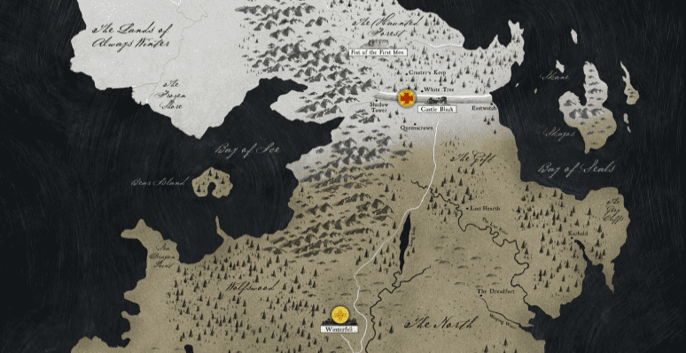
If you look at the browser you will see the first point on the map now has a red background image instead of simply being yellow.
Toggle the Favourite State
Now we have the favourite state working if it was originally defined in the
points dataset. Let's work on adding controls so the user can choose which
points to make a favourite, or not.
We will be adding a plus/minus link beside the close link in the details popup
to control the favourite state. For that reason we will first of all refactor
our styles for the controls so that the .close button style can be shared.
/* app/js/components/Pointer/Pointer.css */

  ...

+ .detailsControls {
+   .control {
+     margin-left: 10px;
+   }
+ }
+
- .close {
+ .control {

  ...
We then also have to update our popup template so that the close link and the
new favourite toggle link are inside of the .designControls wrapper and that
both links now have the class name .control.
The favourite toggle link will render either a + or - text inside of it
conditionally based on the current favourite state.
// app/js/components/Pointer/Pointer.jsx
<header className={styles.headline}>
<h3>{name}</h3>
- <a href="#" className={styles.close} onClick={this.toggle}>
- ×
- </a>
+
+ <div className={styles.detailsControls}>
+ <a href="#" className={styles.control}>
+ {this.state.favourite ? '–' : '+'}
+ </a>
+
+ <a href="#" className={styles.control} onClick={this.toggle}>
+ ×
+ </a>
+ </div>
</header>
We will now a new method called favourite that is similar to the toggle
method. It will read the current value of this.state.favourite and set a new
state with the toggled (opposite) value. Add this method below toggle and
remember to bind its context in the constructor.
// app/js/components/Pointer/Pointer.jsx

  constructor (props) {
    super(props);

    this.state = {
      open: false,
      favourite: props.favourite
    };

    this.toggle = this.toggle.bind(this);
+   this.favourite = this.favourite.bind(this);
  }

  ...

+  favourite () {
+    this.setState({ favourite: !this.state.favourite });
+  }

  render () {

  ...
The final step is to add the onClick handler for the favourite method.
// app/js/components/Pointer/Pointer.jsx

- <a href="#" className={styles.control}>
+ <a href="#" className={styles.control} onClick={this.favourite}>
    {this.state.favourite ? '–' : '+'}
  </a>
After clicking on a pointer to open the details popup you can now click on the
+ or - control and see that it switches each time. If you close the popup
you will see that the favourite state has also been reflected in the pointer
background image.