Step 7
CSS Modules and PostCSS
We now have the map rendered to the screen but we haven't yet been able to style it. Let's add the ability to style the project to make it look better. We could style the project with a regular CSS but instead let's look at how to use CSS modules.
CSS Modules
Because we are using Webpack we can easily add support for CSS modules. CSS Modules allow us to split our CSS into separate files that map to different components of our application. Since we are using React which is based on components these 2 technologies play very well together.
An advantage of using CSS modules is that class names no longer need to be
unique across the whole application. In one module you could have a class name
called .info with a text color green. In another module you can also use the
name .info but have red text.
This is possible because when using a CSS module you import it and apply one of the imported styles as a class name. When the application is compiled a unique hash is built for each class name so from your point of view as a developer two modules can use the same class names but in reality everything will be unique. An example of how this works is 1:
/* styles.css */

.title {
  background-color: red;
}
// index.js

import styles from './styles.css';

element.innerHTML = `<h1 class="${styles.title}">
                       An example heading
                     </h1>`;
This will compile to the following final HTML:
// index.html

<style type="text/css">
._styles__title_309571057 {
  background-color: red;
}
</style>

<h1 class="_styles__title_309571057">
  An example heading
</h1>
As you can see the title styles have a hash appended (_309571057), so
importing .title from another CSS module would result in a different generated
hash, ensuring both classes are unique in the final HTML.
PostCSS
CSS Modules are not in the official CSS spec meaning we can not simply use them in the browser. However, they are available with PostCSS. PostCSS also offers the ability to use other new features available from "CSS Next" 2 (features which are planned for the CSS spec but not implemented yet) such as variables, mixins, nesting, and functions. People who have used SASS/SCSS should be familiar with these concepts, except now we do not need to the SASS compiler and you can be assured your PostCSS syntax will work on day in the browser without compiling at all.
Installing PostCSS
Let's start by integrating PostCSS with our Webpack build. As always let's first
install the necessary dependencies. We will first install the Webpack
postcss-loader. PostCSS features are separated into different packages
depending on the features you need so we will also install postcss for the
core PostCSS functionality, postcss-nested to have a SASS-like nested syntax,
and autoprefixer to automatically handle our vendor prefixes.
Finally we will install style-loader and css-loader as fallback loaders for
Webpack to use to process styles.
yarn add postcss postcss-nested postcss-loader style-loader css-loader autoprefixer
Next we will set up a configuration file for PostCSS, detailing which plugins we
want it to use. Create a file in the root of the project called
postcss.config.js and add the following configuration that tells PostCSS that
we want to use the nested and autoprefixer plugins.
// postcss.config.js

module.exports = {
  plugins: [require('autoprefixer'), require('postcss-nested')]
};
Finally we will extend the loaders section of our webpack.config.js file and
instruct Webpack to look for all .css files (except inside node_modules/)
and use the loaders we installed, in order.
loaders: [
  ...
  {
    test: /\.css$/,
    exclude: /node_modules/,
    use: [
      {
        loader: 'style-loader'
      },
      {
        loader: 'css-loader',
        options: {
          modules: true
        }
      },
      {
        loader: 'postcss-loader'
      }
    ]
  }
]
...
First Webpack will try to parse styles and then look for regular CSS files. Note
that we tell Webpack that we plan to use CSS modules by passing modules: true
to the css-loader options. Finally we apply the PostCSS loader which will take
care of handling all of the modern syntax that we will be writing.
Writing our first CSS Modules
Now that we have the application ready to use PostCSS and CSS modules, let's add
our first CSS module for the <Map /> component.
Create a file called Map.css in the Map component directory. There we will add
a simple class name for the map and write some simple CSS to center it on the
screen and add a border shadow.
/* app/js/components/Map/Map.css */

.map {
  position: relative;
  margin: 0 auto;
  width: 772px;
  height: 1518px;
  box-shadow: 0 0 20px 0 rgba(0, 0, 0, 0.4);
}
Next we will import this CSS module into our React component and apply the styles.
// app/js/components/Map/Map.jsx

import styles from './Map.css';
Add a <div /> wrapper around our <img /> tag and apply the .map styles.
Note: Notice that when coding React components you must pass the property
classNameinstead of simplyclassdue to the fact that JSX is converted to JavaScript and in JavaScript "class" is a reserved keyword.
// app/js/components/Map/Map.jsx

const Map = () => {
  return (
    <div className={styles.map}>
      <img src={westeros} />;
    </div>
  );
};
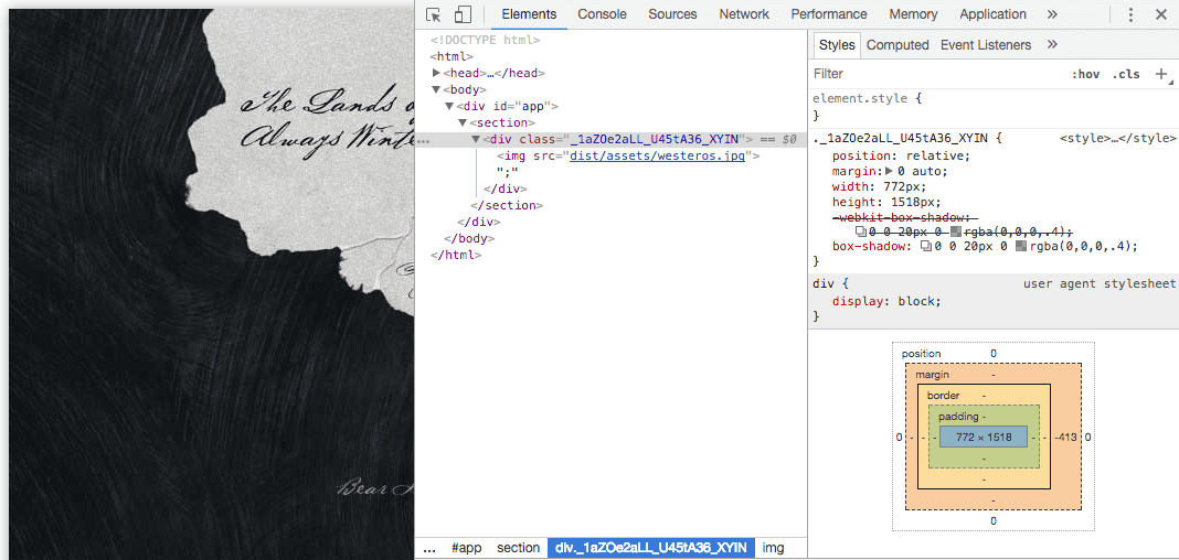
You can now run yarn dev to build the bundle and take a look at the
application in the browser. You will see that the map has had styles applied and
if you open the developer console you will see the generated hash that is
applied by the CSS module. You may also notice that our PostCSS plugins are
working because thebox-shadow rule has been automatically vendor prefixed.
Exploring PostCSS and CSS Modules
We are now confident that we can apply CSS to the project but currently the map is not looking very special. Let's go ahead and theme the application a little and at the same time learn how to use the "CSS Next" features that PostCSS is providing for us.
First we will update the Map from using an <img /> tag to being a background
image. This will allow us to support high definition screens by using the
background-size rule.
/* app/js/components/Map/Map.css */

.map {
  position: relative;
  margin: 0 auto;
  width: 772px;
  height: 1518px;
  box-shadow: 0 0 20px 0 rgba(0, 0, 0, 0.4);
+ background-image: url('../../../img/westeros.jpg');
+ background-size: 772px 1518px;
}
We can then also update the Map component because it no longer needs the <img /> tag or the westeros graphic to be imported. We will now only have a single
<div /> being returned from the Map component and the image is being loaded
via the CSS (which the file-loader is still resolving for us) instead of as a
JavaScript import.
// app/js/components/Map/Map.jsx

import React from 'react';

import styles from './Map.css';
- import westeros from '../../../img/westeros.jpg';

const Map = () => {
  return (
-    <div className={styles.map}>
-      <img src={westeros} />;
-    </div>
+    <div className={styles.map} />
  );
};

export default Map;
If you run yarn dev again and view the changes, you will see the map is
already looking better.
Using CSS Variables
Our CSS module is now using the width and height values twice. Let's clean this
up by using CSS variables to set the value and apply them using the var
syntax.
/* app/js/components/Map/Map.css */

.map {
  --mapWidth: 772px;
  --mapHeight: 1518px;

  position: relative;
  margin: 0 auto;
  width: var(--mapWidth);
  height: var(--mapHeight);
  box-shadow: 0 0 20px 0 rgba(0, 0, 0, 0.4);
  background-image: url('../../../img/westeros.jpg');
  background-size: var(--mapWidth) var(--mapHeight);
}
Styling Global Elements
At this point it would be good to have the background colour of the page match the map a little better. When using CSS modules with React no module can be applied directly to the body but we can still style the body by adding rules for it in any CSS module.
As it would be confusing to style the body inside the CSS component for the Map,
it is a better practise to create a CSS module for your root <App /> component
and put all global styles and variables there.
Let's create an App.css file inside the App component directory and add the
body background color. We will also add some default font rules that we will
need later.
/* app/js/components/App/App.css */

body {
  margin: 0;
  padding: 0;
  background: #171a1d;
  color: #fff;
  font-family: Palatino, Georgia, serif;
}
We then import this CSS module into the <App /> module. We will also have to
tell ESLint to ignore the no-unused-vars rule for that import since we have to
provide a named variable that the styles are imported to but in this case we
have no class names to actually apply in our markup.
// app/js/components/App/App.jsx

import Map from '../Map';

+ // eslint-disable-next-line no-unused-vars
+ import styles from './App.css';
Sharing Variables via :root
Finally, let's move the generic values we are using in the body to CSS
variables so that they can be reused later. Instead of storing them inside the
definition for body, let's look at :root.
The
:rootCSS pseudo-class matches the root element of a tree representing the document. In HTML,:rootrepresents the<html>element and is identical to the selector html, except that its specificity is higher. 3
This means that definitions done inside of the :root selector will be global
to the page, so in order to share variables across CSS modules we can move them
there. Let's now create variables for the generic styles and also move the Map
variables here away from the Map.css module and into the App.css module.
/* app/js/components/Map/Map.css */

.map {
-  --mapWidth: 772px;
-  --mapHeight: 1518px;
-
  position: relative;
  margin: 0 auto;
  width: var(--mapWidth);
  height: var(--mapHeight);
  box-shadow: 0 0 20px 0 rgba(0, 0, 0, 0.4);
  background-image: url('../../../img/westeros.jpg');
  background-size: var(--mapWidth) var(--mapHeight);
}
/* app/js/components/App/App.css */

:root {
  --background: #171a1d;
  --text: #fff;
  --fontStack: Palatino, Georgia, serif;

  --mapWidth: 772px;
  --mapHeight: 1518px;
}

body {
  margin: 0;
  padding: 0;
  background: var(--background);
  color: var(--text);
  font-family: var(--fontStack);
}
Now run yarn dev again and refresh the changes to see the application now has
a dark background and the map is still positioned as before.

Next Steps
If you have had enough of constantly typing yarn dev then luckily the next
step is to introduce webpack-dev-server which will take care of building out
app each time we change a file.